(877) 663-5483
 (844) 333-1387
Interior Office Colors that Will Boost Employee Productivity

In the same way that paint colors can affect the mood of your home, they can also affect the mood of your workplace. Studies have recently shown that white, beige, and gray offices are more likely to induce sadness and feelings of depression in women, as well as some men. Most men experienced these types of feelings in orange and purple spaces, as well. It isn’t just about changing the mood, though.
Paint colors can actually have an impact on many aspects of our lives, including our productivity.
Something as simple as a coat of paint can change the way that people work, so why wouldn’t you take advantage of that to create a more effective, enjoyable, collaborative workspace?
The Science
Although many people assume that people’s response to color is subjective and so it must also be unpredictable, studies have shown that combining psychology with the study of color actually produces accurate results on a startlingly regular basis. The types of colors and their intensity have a profound impact on mood and behavior. Just as you’d paint a bedroom a calming blue to create a relaxing space, you’re going to want to find the best colors to create the right environment in your workspace.
While someone might enjoy the color red on a personal basis, they might find it too aggressive for a creative workspace that requires a lot of mental collaboration, for example. It’s all about figuring out which colors elicit which responses, as well as the behaviors that follow. You can’t just ask people, either. You have to watch, wait, and see what works. Fortunately, that part has already been done for you.
The Colors
Now that we’ve laid the groundwork for a better understanding of exactly how color can impact productivity and other behavioral characteristics, let’s delve into the most popular colors for creating the ideal workspace, no matter what kind of business you have.
Blue
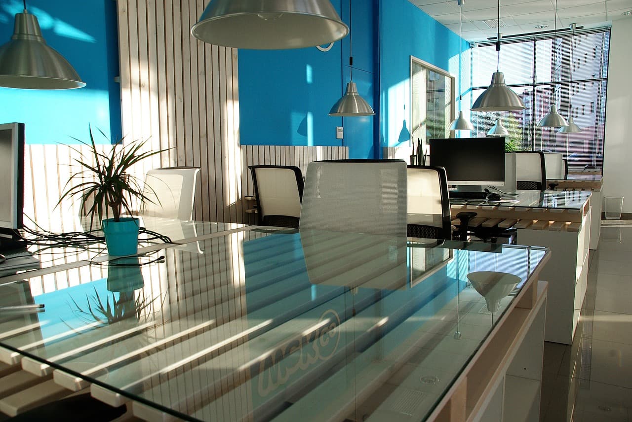
Blues are intellectual. They foster communication, logic, efficiency, and trust. The various shades and saturations of blues will have different effects, but brighter and warmer hues that create a clean, professional look seem to be the most effective. You can rely on a good shade of blue to help with focus and reducing mental strain.
Red
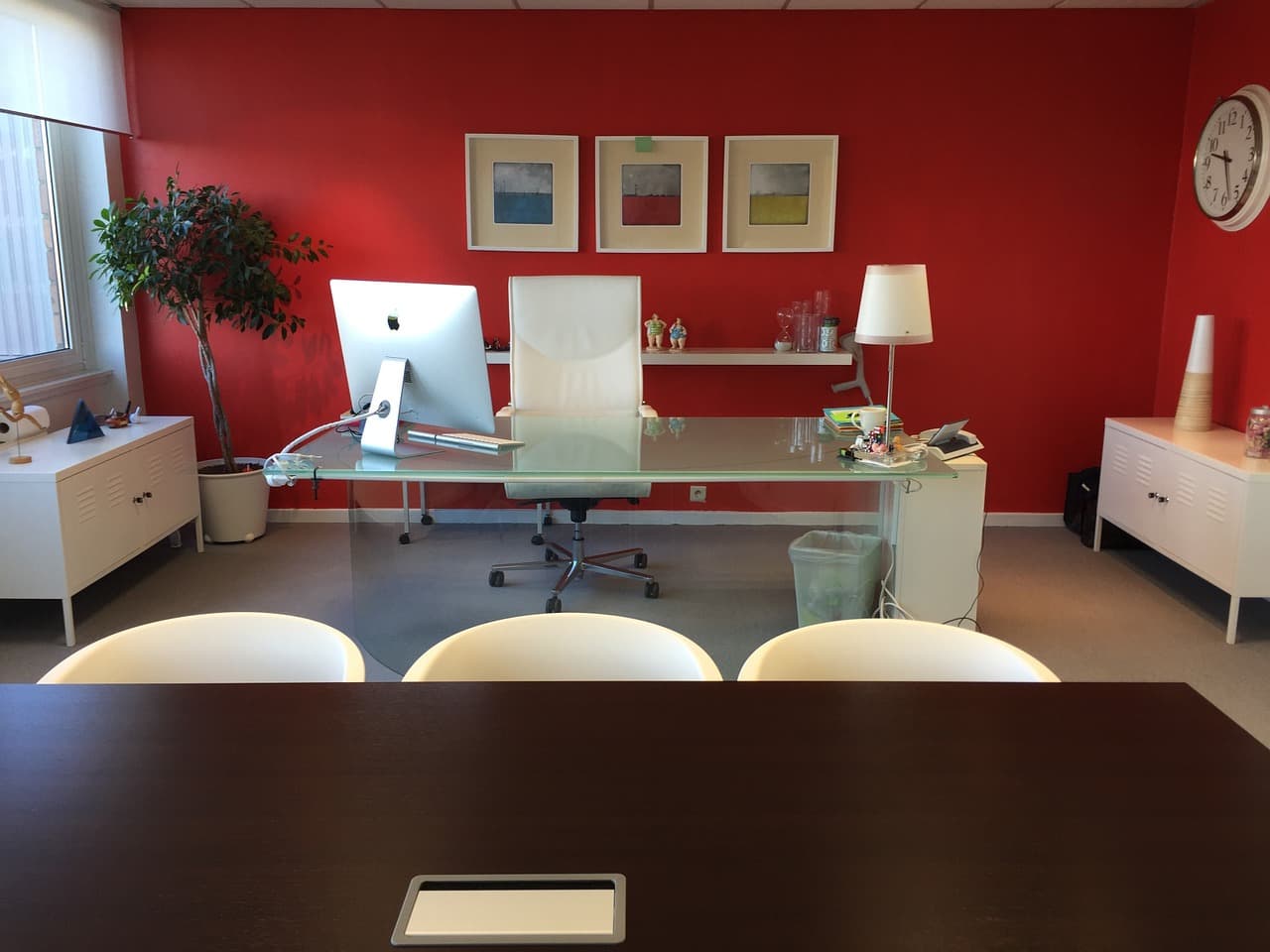
In physical spaces, red is a bold, physical color that fits right in. This color represents excitement. It also stands for strength, courage, and power. It can be a great asset in gyms, warehouses, and other areas where physical exertion or power are required to get the job done.
Yellow
If you’re trying to create a friendly, creative environment, yellow is the way to go. Yellow also evokes optimism, confidence, and happiness, so you can guarantee that you will stimulate a more productive workplace when you choose a great shade of yellow. After all, when people feel their best, they do their best work. Many bright, warm shades of yellow can deliver. Just make sure they’re not too muted or beige-based, or you could create a boring, stale look by accident.
Green
Although some people find it bright or uninviting, green actually represents balance. It’s easy on the eyes because it doesn’t require an adjustment to see the various hues. It also represents nature, harmony, and restoration. If you’re trying to create a sense of balance or need a space that invigorates people over the course of long hours, green does wonders. You’ll often see it in hospitals and medical offices, and that’s because it offers that sense of balance.
Purple
Purple is a tricky color. It is often associated with luxury, and can also be associated with spirituality or deep contemplation. Keep in mind, though, that you have to use it carefully and sparingly to create the right look. Too much or the wrong shade can create the exact opposite effect, which is the last thing that you want.
Orange
We’re not referring to safety orange here. Pumpkin shades and gold-toned oranges are warm, homey, and inviting. They are often associated with food and gathering, which makes them popular in kitchens and dining spaces. Certain bright oranges can be fun and punchy, creating a great choice for a casual office or an office lounge area.
A Warning About Grey
Many offices attempt to incorporate grey into their paint scheme, thinking that it offers a modern, sleek finish. This neutral color, however, can often create a depressing environment and create a lack of confidence when used in the wrong hues or shades. You can use grey as an accent color to help create an efficient, productive workspace, but you have to be careful about the tones that you choose because the implications can be so varied in this particular color palette.
How to Choose
You can count on any of these colors to evoke productivity, creativity, and other positive workplace vibes. Choosing the ideal one, of course, may prove to be a bit more of a challenge. It’s going to be up to you to consider all of the options and figure out what exactly you are going for in terms of creating the right environment with the paint color that you choose.
Start by thinking about the two or three elements discussed above in the various colors that are going to be most important to you. As a refresher, these were things like:
- Trust
- Logic
- Communication
- Warmth
- Creativity
- Productivity
- Focus
- Balance
- Power
When planning your commercial painting project, which of these things would you most like to evoke? Choose the feelings or effects that you prefer, and then you can link them back to the appropriate paint color. Before you actually go get samples, though, you should do a little research to see what shades of these colors other professional spaces are using. That’s why in some of the color descriptions, there are details about different hues or shades that may have different effects.
A bold, deep red can be a very powerful color. A dull, faded brick-brown, however, can create a dark, uninspiring space and make it hard to match other décor. Get samples and test cans so that you can try out a few different colors in various areas of the office until you find what works best. If you really want to make sure that you’re evoking the best responses, get input from your employees while you’re sampling colors.
The Exceptions
As with every “rule” or trend, there’s always going to be at least one exception. In the case of office painting, there are some instances where you aren’t going to be able to rely solely on these color recommendations to create the perfect mood. You have to also take your office and the people in it into consideration.
If you have a large office of over 500 employees, it’s less likely to have a detrimental effect on an individual basis. However, if you have a home office or small business where there are only a few employees, you might have to think a little deeper into your decision.
For example, if there are four people in your office and two of them think that yellow is obnoxious, it doesn’t matter what the studies say. Painting your office yellow means that at least two of your employees will be bothered by the color, rather than benefiting from it.
There’s no sense in wasting your time sticking to the “rules” when trying to create the perfect workplace environment with painting if you know that you have considerations that go beyond them.
The best way to go about choosing colors is to think of this information as a guideline, rather than a hard-and-fast rule. Colors are just as varied as people’s responses to them and, at the end of the day, you have to figure out what is going to be best for your office space.
The good news is that more often than not, you’ll end up with some shade on the list above anyway, so you’ll know that you’re on the right track to creating the most effective office possible, no matter what business you’re in.
Colors to Avoid
An office needs to look professional, even if you’re spicing it up a bit with bolder, brighter colors. Some shades just won’t work. Besides white, you should try to avoid any tired beige shades that could create a drab feeling. Also, stay away from blacks and dark greys, as they can be seen as too aggressive or just too dark, and send the wrong message.
Don’t use bright or “kid” colors, in most office spaces. Unless your company deals with kids’ products or services, you need to keep the look professional. Primary colors often look basic and don’t give the professional vibe that you had in mind. Take advantage of the selection of shades and hues and choose something a little more professional that still creates the same mood.
Wrapping Up
There is science behind the office color discussion. However, there’s also a lot of subjectivity and circumstance to factor in. Make sure that you keep these colors and their effects in mind for your next office paint job, and you’ll be on the right track to creating a more productive space in no time at all.