(877) 663-5483
 (844) 333-1387
Transforming Retail Spaces with Painting Strategies That Attract Customers
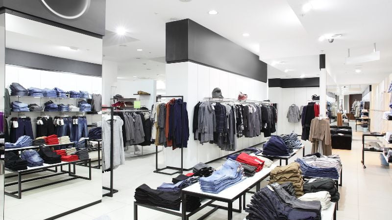
In the retail environment, commercial painting plays a crucial role in creating a space that attracts customers and encourages them to stay, browse, and ultimately make a purchase. While product selection, layout, and customer service all play crucial roles in the retail experience, the store’s aesthetic appeal can significantly impact customer behavior. Among the most effective yet often overlooked tools for transforming a retail space is the strategic use of paint.
This article explores how the right painting strategies can enhance the customer experience in retail environments, from increasing dwell time and improving brand identity to creating welcoming atmospheres that make customers want to return.
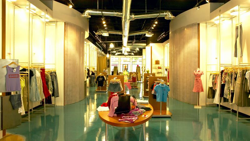
The Power of Color in Retail Spaces
Color is a powerful tool in retail design, influencing mood, behavior, and even purchasing decisions. Different colors evoke different emotions, and when used strategically, they can help create the desired atmosphere in a retail space. Understanding the psychology of color is essential for making informed decisions about using paint to transform your store.
Red: Creating a Sense of Urgency
Red is a dynamic and powerful color that grabs attention and creates a sense of urgency. It’s often used in retail environments to highlight sales, promotions, or limited-time offers. Red’s ability to stimulate the senses makes it ideal for areas where you want to encourage quick decisions, such as checkout counters or sale racks.
However, red can also be overwhelming if overused, so it’s best employed as an accent color rather than a dominant hue. Consider using red for signage, accent walls, or display backgrounds to draw attention to specific products or areas within your store.
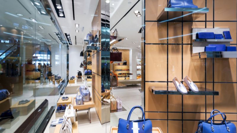
Blue: Promoting Calmness and Trust
Blue is known for its calming and reassuring qualities, making it a popular choice in retail spaces where you want to create a sense of trust and reliability. Lighter shades of blue can make a space feel more open and airy, while darker blues convey a sense of professionalism and stability.
For retailers in electronics, financial services, or health and wellness industries, blue can be particularly effective in creating an environment where customers feel at ease and confident in their purchasing decisions. Consider using blue as a primary color for walls to complement your existing signage and branding elements to reinforce a trustworthy image.
Green: Connecting with Nature and Wellness
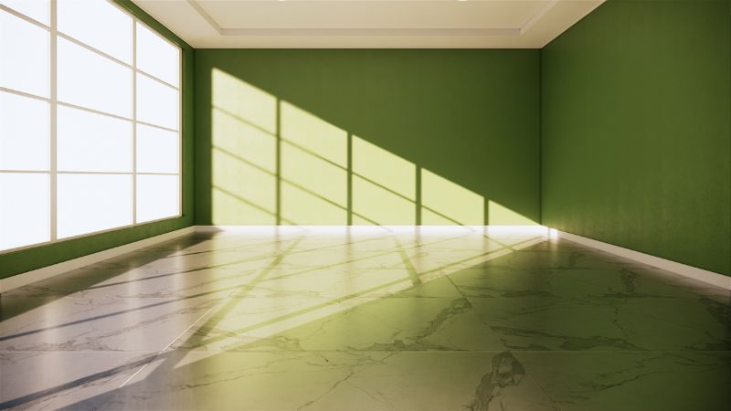
Green is strongly associated with nature, health, and wellness, making it an excellent choice for retail spaces that emphasize these values. From organic grocery stores to eco-friendly boutiques, green can help create an environment that feels fresh, natural, and rejuvenating.
In addition to its calming effects, green is believed to reduce stress, making it an excellent color for environments where customers want to feel relaxed and at ease. Use varying shades of green to create depth and interest. Consider pairing it with natural materials like wood or stone to enhance the connection to nature.
Yellow: Evoking Warmth and Optimism
Yellow is a bright, cheerful color that evokes happiness and optimism. It’s often used in retail environments to create a welcoming atmosphere and encourage positive associations with your brand. Yellow can also stimulate mental activity, making it a good choice for areas where you want to draw attention to specific products or encourage customer interaction.
However, like red, yellow can be overpowering in large quantities, so it’s best used as an accent color to complement. Consider incorporating yellow into your store’s entryway, signage, or display areas to create a warm and inviting first impression.
Orange: Encouraging Excitement and Energy
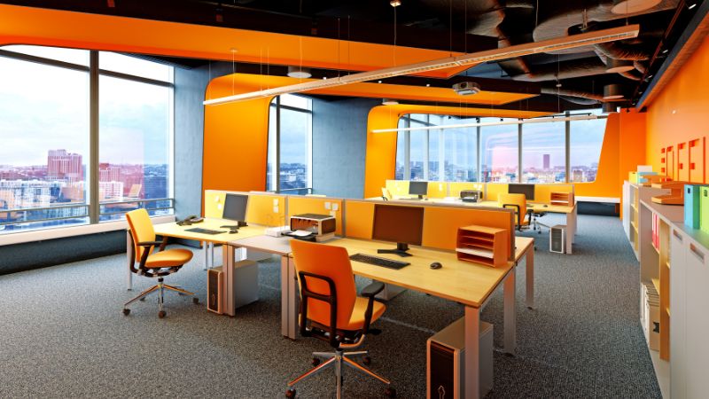
Orange combines the energy of red with the warmth of yellow, making it a highly stimulating color that encourages excitement and enthusiasm. It’s often used in retail spaces where you want to create a lively, energetic atmosphere, such as in sports stores, gyms, or youth-oriented fashion boutiques.
Because orange is bold, it works well as an accent with more neutral tones like gray, white, or beige. Use orange strategically to highlight new arrivals, special offers, or high-energy areas within your store.
Neutral Colors: Creating a Sophisticated Backdrop
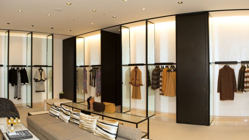
While bold colors have their place in retail design, neutral tones like white, gray, and beige provide a sophisticated backdrop that allows products to take center stage. Neutrals are versatile and can be paired with almost any color, making them a popular choice for stores that want to maintain a clean, modern aesthetic.
Neutrals are particularly effective in high-end retail environments where the focus is on luxury goods or spaces where you want the merchandise to stand out without competition from the surrounding decor. Consider using neutral colors for most of your store’s walls, with bolder accents used sparingly to create focal points.
Strategies for Enhancing Brand Identity Through Paint
Your store’s visual identity is a crucial component of your brand, and paint can play a key role in reinforcing that identity. By choosing colors that align with your brand’s values and message, you can create a cohesive experience that resonates with your customers and strengthens brand recognition.
Aligning Color with Brand Values
The colors you choose for your retail space should reflect your brand’s values and personality. For example, if your brand is about sustainability and eco-friendliness, shades of green and earthy tones can help convey that message. If your brand is focused on luxury and exclusivity, deep, rich colors like navy, burgundy, or gold can reinforce a sense of sophistication. Many of these colors can be easily paired with a sophisticated neutral color.
Consider how your brand colors are used in your logo, marketing materials, and online presence, and incorporate those same colors into your store’s design. This consistency helps create a seamless customer experience, from their first encounter with your brand online to their in-store visit.
Using Color to Differentiate Your Space
In a crowded retail market, standing out from the competition is essential. One way to differentiate your store is by using a unique color palette that sets you apart. This doesn’t mean you need to use unconventional or shocking colors, but rather that you should carefully select distinctive and memorable hues.
For example, a store specializing in artisanal, handmade products might use a warm, earthy color scheme reflecting the craftsmanship and authenticity of the items sold. On the other hand, a tech store might opt for sleek, modern colors like metallic grays and blues to convey innovation and cutting-edge technology.
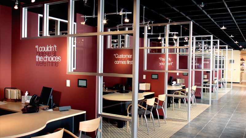
Reinforcing Brand Identity with Accent Colors
Accent colors are an excellent way to reinforce brand identity while adding visual interest to your retail space. These colors, like feature walls, display units, or signage, can be used strategically to draw attention to essential products or promotions.
When selecting accent colors, consider how they complement your primary brand colors and how customers will perceive them. For example, if your primary brand color is blue, you might use a complementary color like orange as an accent to create a dynamic, eye-catching contrast.
Increasing Dwell Time with Thoughtful Color Choices
Dwell time, or the time customers spend in your store, is crucial for retail success. The more extended customers stay, the more likely they are to purchase. One effective way to increase dwell time is by creating a welcoming and comfortable by taking advantage of the walls that surround your commercial space.
Creating Zones with Color
One strategy for encouraging customers to spend more time in your store is creating distinct zones using color. For example, you might use different colors to designate areas for browsing, relaxing, and interacting with products. This helps guide customers through the store and makes the space feel more organized and inviting.
For instance, you could use calming, neutral tones in areas where customers are encouraged to linger and explore, such as seating areas or product displays. In contrast, more vibrant colors can be used in high-energy zones, like the checkout area or promotional displays, to create a sense of excitement and urgency.
Enhancing Comfort with Calming Colors
Comfort is critical to increasing dwell time, and the colors you choose can significantly impact how comfortable customers feel in your store. Soft, muted colors like pastels, grays, and beiges create a relaxing atmosphere that encourages customers to take their time and explore your offerings.
In addition to wall colors, consider how other elements of your store’s design, such as flooring, furniture, and lighting, contribute to the overall ambiance. A cohesive color scheme that promotes comfort and relaxation can make your store a more enjoyable place to spend time, leading to longer visits and increased sales.
Encouraging Exploration with Strategic Accents
While comfort is essential, you also want to encourage customers to explore different areas of your store. Using strategic accent colors can draw attention to specific products or sections, prompting customers to move through the space and discover new items.
For example, a bright, contrasting color used on a feature wall or display unit can create a focal point that catches the eye and invites further investigation. This technique is particularly effective for highlighting new arrivals, seasonal promotions, or high-margin products.
Creating a Welcoming Atmosphere with Paint
First impressions are crucial in retail, and the atmosphere of your store plays a significant role in shaping those impressions. A welcoming atmosphere makes customers feel comfortable and encourages them to return in the future. Paint is a versatile tool for creating an atmosphere that aligns with your brand and appeals to your target audience.
Welcoming Entrances with Inviting Colors
The entrance of your store is the first thing customers see, setting the tone for the entire shopping experience. Inviting colors at the entrance can make your store feel more approachable and welcoming.
Warm colors like soft yellows, peaches, or light oranges can create a cheerful and inviting entrance, while cool colors like light blues or greens can convey calmness and serenity. The key is choosing colors that align with the mood you want to set when customers step inside. Using accent colors or a well-placed mural can further enhance the entrance, making it a visually appealing focal point that draws customers in.
Creating Comfortable Spaces for Customer Interaction
Once customers are inside, the colors you use throughout the store can help create a comfortable environment where they feel at ease exploring and interacting with products. For instance, soft, muted tones can create a calm and inviting atmosphere, making customers more likely to spend time browsing.
Consider using warm, neutral colors in seating areas, fitting rooms, or any space where customers are encouraged to relax and spend time. These areas should feel like a natural extension of your brand, reflecting the same colors and themes in the rest of the store. Incorporating complementary accents, such as colorful cushions or artwork, can add a touch of personality while maintaining a cohesive look.
Fostering a Sense of Belonging with Cohesive Color Schemes
A cohesive color scheme throughout the store helps to create a unified, welcoming environment that fosters a sense of belonging among customers. This sense of belonging can encourage repeat visits and build customer loyalty.
Consider how the colors will work together across different store areas when choosing a color scheme. A well-coordinated palette can guide customers naturally through the space, creating a seamless shopping experience. This doesn’t mean every room has to be the same color, but rather that the colors should complement each other and flow together harmoniously.
Final Thoughts
Painting is more than just a finishing touch in retail design—it’s a powerful tool that can transform the atmosphere of your store, influence customer behavior, and reinforce your brand identity. By carefully selecting colors that align with your brand values, enhance the shopping experience, and create a welcoming environment, you can attract more customers, increase dwell time, and drive sales.
Whether opening a new store or refreshing an existing one, working with a professional painting company can help you achieve the best results.