(877) 663-5483
 (844) 333-1387
Should You Paint Before or After You Move In?
There is a hugely exciting moment, after the mountain of paperwork has all been signed when you accept the door keys, and you realize the house is really yours. Your first thought is, “Let’s get moved in!”
Second thoughts, it is said, are better than first thoughts. Perhaps after the initial joyous urge to move everything into your new home, a second thought question entered your mind: “Wait. Is it better to paint before or after moving in?”
This is the sort of question thoughtful, successful homeowners ask. Some have suggested that it’s better to move in first, set up all the furniture, and decide what colors should go where. The prevailing thought, however, is that it is much wiser to leave the furniture in your current dwelling or in storage—or, if you haven’t bought it yet, don’t go on a furnishing’s spree just yet. First, paint the home, then move in. Here are five reasons that make good sense.
Save Half of the Work by Not Moving Twice
When you bought your new place, you bought it with colors and trim that someone else had chosen for it. Just as much as having the front door keys, transforming the house with shades, hues, tones, and textures that are purely yours will make it your new home. As long as you’re going to paint the house, you can save half the work of moving the furniture by leaving it where it is while you paint. That way, it will not have to be moved around the house or even out for the purposes of painting.
Protect Your Possessions by Not Moving Them
As any mover will tell you, the majority of damage that is done to your possessions—broken glass, fractured chair and table legs, gouged furniture—happens when they are being moved from one location to another. Painting the inside of your home will entail that sort of danger since everything is going to get moved across the room or from room-to-room, not mention that it will be covered with drop cloths. There is the added possibility that the dust and even paint that accompany such a project will end up covering your furniture and possessions as well. So long as they remain in your former dwelling or in storage while painting is taking place, the risk of harm is cut in half. If working with professionals, they will take the proper precautions to minize the risk of any damage to your personal property.
Ease of Choosing a Color Palette without Interference
Deciding what shades and tones of color you want is a difficult enough decision when you’re not wandering between stacked boxes and furnishings that don’t yet know where they belong. It is so difficult to know how cavernous a great room will feel or how claustrophobic a walk-in closet will be when these rooms are jammed with furnishings and clothing. Bringing in distinctly colored paintings or furniture or even clothes has a way of selecting room colors for you, rather than your choosing the colors these items must fit. The essence of determining how you want your home to look depends on your ability to envision each room without interference, even from your possessions.
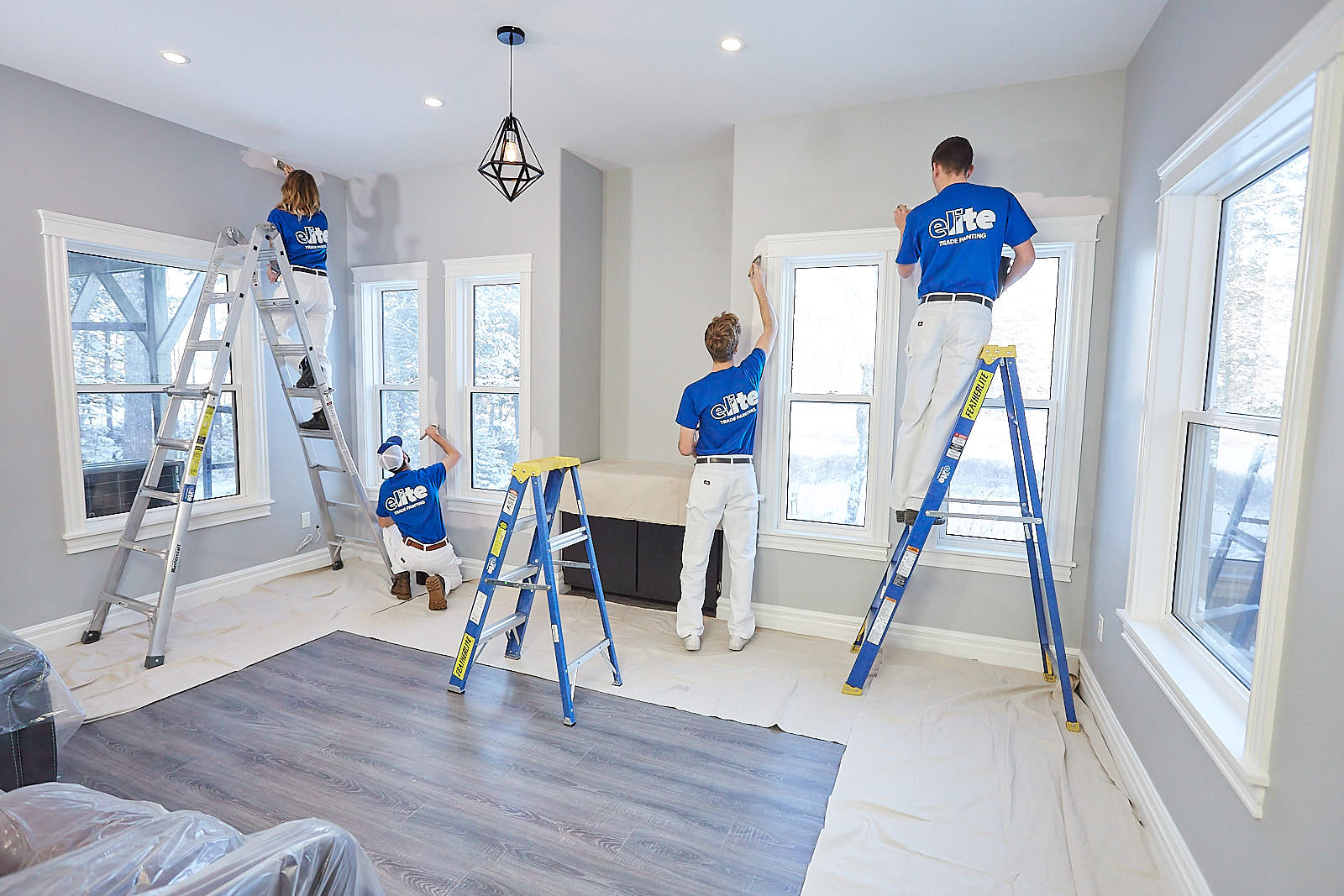
Professional Painters, Best Way to Get the Interior Painting Done
If painting before moving in is the better option, then using professional interior painters is the best choice for getting the painting done promptly and correctly. Painting the inside of your new home is a large undertaking. If you entrust that job to capable, experienced professionals, there will be very little lag time between your choosing your paint colors and the painters finishing the job. A home with no furnishings speeds the project for these workers tremendously since there nothing to move around and no furniture to treat with extra caution. All the painters have to contend with is getting the job done as expertly and quickly as possible.
Make the Home Truly Yours
Each homeowner has a personal palette of complementary hues. Your unique tones and shades of color make you feel at home. They express your personality to all who visit your new home. They convey your standards, your individuality, and your hospitality to all who enter your dwelling. To make your home truly your own, it must bear your colors as you wish them to be seen. The proper time to make these ideas a reality is when the home can quickly be transformed into your vision of what it should be.
Breathing Life into Your Design Dreams
It’s simple enough to see the validity of these ideas, but sometimes we get stuck trying to figure out exactly how to turn our visions into reality. For instance, when it comes to choosing the right colors, we know what we like and the beauty we want our homes to express, but we aren’t quite sure how to make it happen. Here are a few tips to energize your design efforts:
Ask yourself which room in your home will be central to everything that happens. Will it be the kitchen? Will it be the great room? Is the master bedroom the most important room to me? Once you have chosen that place that is central in importance, assign it your absolutely favorite color.
Next, ask yourself to which room in the house do you want to assign the boldest color you love. The caveats that go with the selections so far are that these two colors must work together, even if you cannot see the two rooms at the same time. They can either contrast with one another or blend with one another, just so they don’t clash with each other.
Now make a note of which rooms can be seen from what other rooms as you walk through the house. In this age of open concepts, you may be able to see every room but the bedrooms from a central location. An important idea here is that, even with an open concept home, you can use the different colors of your palette to suggest where one “room” end and another begins.
A great way to proceed at this point is to use samples that have different shades of the same color or hues that blend harmoniously even though they are different colors. Your goal is to guide the eye through the home with enticing, blended, but distinct colors.
It’s important to bear in mind a couple of simple principles at this point: darker colors appear to reduce space and lighter colors appear to enlarge space. Also, connecting spaces, such as hallways and staircases, are good places to move from one color to another, but you want the colors in these spaces to be neutral rather than eye-catching. These are the transition spaces in the home.
I Know What I Like, But What Does It Imply?
Beyond being pleasant—or unpleasant—to look at, every color has an emotional impact on us. This is not hypothetical, but rather a scientifically studied and verified reality. You’ve heard expressions such as, “I’m so blue,” which conveys that a person is sad. The colors that surround us don’t just express who we are, but they also emotionally impact us as well. Below are some examples of different color ranges and the emotional effects these colors are said to have upon us. We have waited to mention this at this point in the blog because we do not want you to disavow your favorite color. Rather, use your color choices to complement one another and to be subtle in their underlying meaning and power. Remember in your choices that colors do impact mood. Here are the emotional reactions to different colors:
Green
Green is the most pleasing color to the eye. It is the color of serenity. Green has a way of soothing and calming. It encourages relaxation and is a balm for those feeling stress. Some experts have suggested it as a great color for bedrooms.
Yellow
Yellow is an interesting color because it engenders two different reactions. As an energetic and uplifting color, it wonderful for kitchens, entries, small places like bathrooms, and utilities. Yellow feels like hospitality. On the other hand, yellow is not a stabilizing color. In constant yellow rooms, people become irritable over time. Babies actually cry more in yellow rooms. Yellow is generally considered a poor choice for a basic color scheme.
Blue
Blue, first of all, is said to be a healthy color. Blue cause the body to calm down, lowering respiration and heart rate. Pastel blues can make a person feel chilly, which is why designers usually balance light blues with warmer hues. While lighter blue shades are a calming basic color, dark blues—as said above—evoke sadness. It also should be avoided as the primary color of a palette.
Red
Red is a very energetic color. It’s the most intense of colors and is known to stimulate conversation and draw crowds together. It may not be the best main color health-wise, since red has been shown to raise blood pressure and heart rate. It’s a good initial color for entryways and dining rooms.
Purple
Purple is associated with creativity and sophistication. Purple has a restful quality similar to blue, although it doesn’t cause chilliness the way blue does. Purple as depth and intrigue as a secondary or contrasting color.
Orange
Orange, like red, is a vibrant, energetic color that provokes enthusiasm. Orange is a good color for an exercise room or a mudroom. It seems to evoke emotional expressions. In traditional Chinese and Indian medicine practices, the color orange was thought to increase energy and heal breathing.
Beyond individual colors, its worth noting that the shades of colors—their lightness or darkness—are very consequential. Lighter colors tend to make things appear larger. Dark colors make things feel warmer and more intimate.
Note that colors fall in one of three categories in terms of their emotional impact on us: either passive, active, or neutral.
Finally, neutral colors: gray, white, brown, and black, are grounding colors. They are extremely flexible and can be used with any color scheme you choose. The greater the percentage of neutral color in a color scheme, the calmer the effect it has upon us.
The Artist Creation Is Your Design Tool
Finally, in case you know what your colors are, but you’re not so sure about how to blend them or to choose contrasting colors, let us reintroduce you to something you saw and may have used when you were in grade school: the color wheel. The color wheel is tremendously useful because it shows us what colors are related, what colors are contrasting, what colors blend, and what colors clash. Here are principles about how the color wheel can help choose colors for your new home:
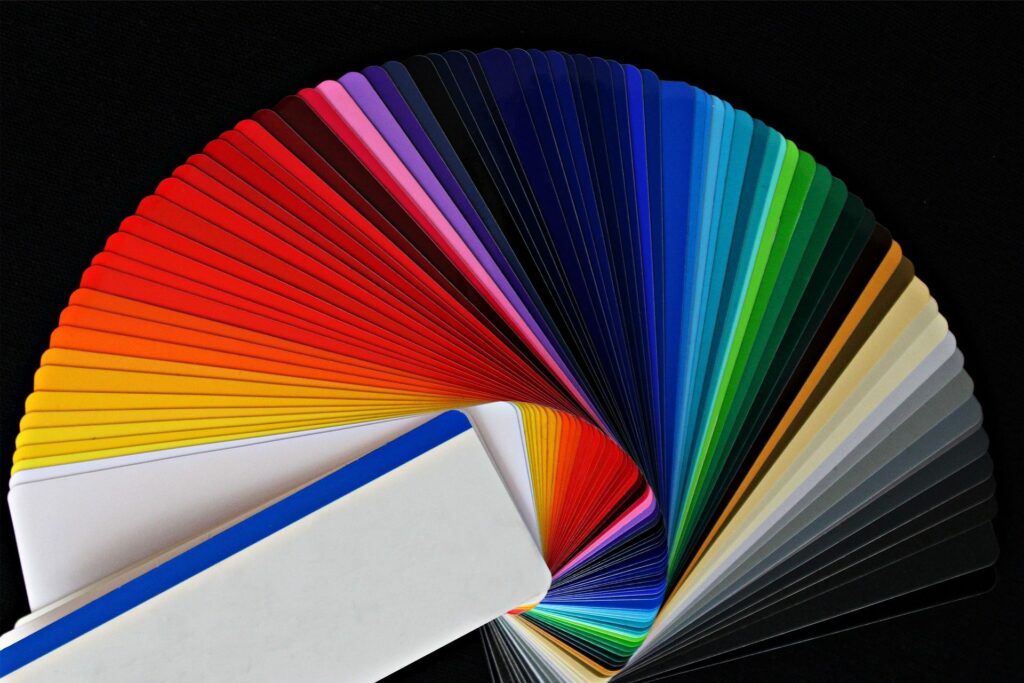
The color wheel is just that, a circle on which all the colors appear. We could say “all the colors of the rainbow,” but blue does not appear in a rainbow. So, a color wheel has more colors than the rainbow. It features the three primary colors (red, yellow, and blue), the three secondary colors (green, orange, and purple) and six tertiary colors. Each of these colors on the color wheel sits opposite the color it perfectly contrasts with: red is opposite green, blue is opposite yellow, and purple is opposite orange.
These are the basic colors on the wheel, along with their opposite complimentary colors. Complimentary colors work together in small doses but need to be seasoned with neutral colors. This means, if you’re going to have purple and orange together in a room, you need a buff or black or white to “tone down” the effect of the two colors together.
Now that you have selected your favorite colors, you can alter them for the effect you want in several ways. You can change the “tone” of a color by darkening it slightly by adding or subtracting the color gray. You can change the “shade” of a color by adding or subtracting the color black. You can change the “tint” of a color by adding or subtracting the color white. So colors can blend and remain complimentary if the same amount of neutral colors are added to them.
There are many different color schemes using the color wheel. If you are having trouble finding the matching or contrasting colors you want, try using a color wheel to see what nature suggests.
The question is, should you paint your home before or after you move in.
The wisest answer is, hold off on moving in until you have picked out the color scheme you want, brought in topflight interior home painters, and had a chance to see your completed color design dream.
Make your home uniquely your own through the colors you choose.