(877) 663-5483
 (844) 333-1387
The Hue and You: Understanding the Color Wheel
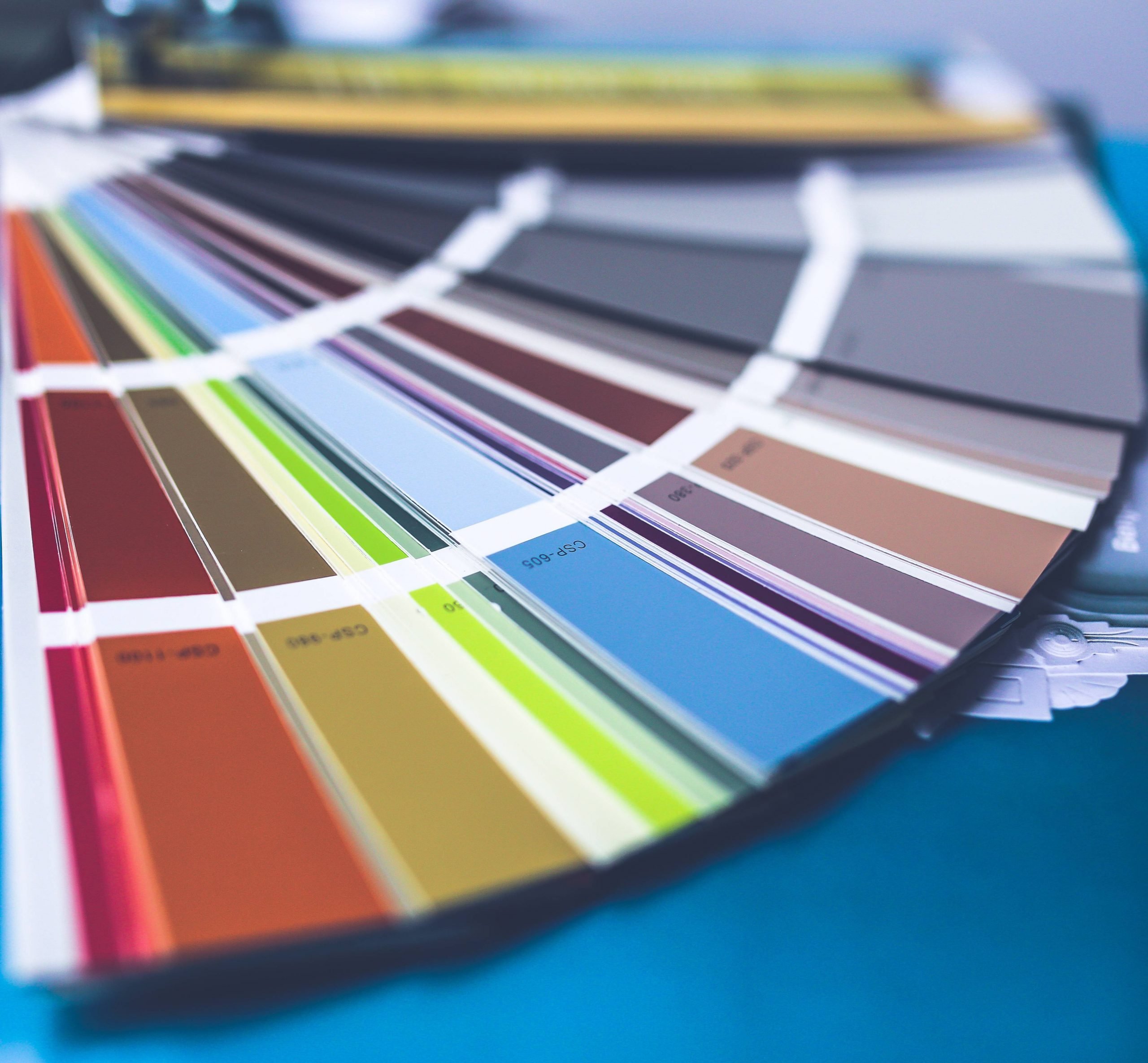
We’ve all been to a paint store or in the paint section of our favorite hardware store and looked at the wall of color swatches. The rainbow is beautiful to behold in all its many hues and colors. But when you must narrow down all the options to a single color it can be overwhelming.
When you’re picking paint, you’re not just choosing a color for your walls. You’re selecting the mood and feel of your room. Colors have energy. Some make a room feel warm, while others make a room feel more spacious. Different paints will encourage different color pallets, but how do you know what colors look best together? How do you choose a color that suits your needs and also fits your aesthetic desires? Worry no more, your fellow humans have already created a neat tool that can help you understand the ins and outs of color—the color wheel.
We at Elite Trade Painting will share our color expertise and help answer all your color questions. What is color? What is the color wheel, and why is it useful to the everyday person? This article will help you understand color better.
What Is Color?

Color is not a tangible thing you can possess, though objects will have varying degrees of color intensity. Color is all about the wavelengths of reflected light at certain frequencies, and here’s how it works.
Light waves hit an object. That object absorbs most of that light but reflects the light it doesn’t absorb to your eye. This reflection of light is what your brain processes and turns into color. The color we see depends upon the wavelength and frequency that the object reflects, which is determined by the physical qualities of the item that we’re looking at.
The colors we see are aptly called the visible color spectrum. When an object reflects all the light that hits it, we observe the color white. When an object absorbs all the light, we see the color black. All the other colors of the rainbow our eyes can perceive spring from wavelengths that lie in between the polar colors of white and black. The lowest frequency of colors we can identify lies within the many shades of red, while the highest frequency of color we can see lies at the other side of the spectrum in violet.
However, there are many aspects of light reflection that affect the color your eyes see. For example, the kind of light that hits the object can change its appearance. White light from certain light bulbs and the sun brings forth the purest color from an object. Artificial lights are often tinted red or blue which will change the color you perceive. The best light to view and identify color in is in diffused sunlight, which is described as the light found on a hazy day about an hour before or after midday. This light is the purest white light and will make the object you’re looking at reflect the best color.
Apply This Knowledge
When you’re looking to paint a room, consider the kind of light your paint will be exposed to. Is it natural? Mostly artificial? Are the bulbs you use tinted?
When you look at the paint options in a store, realize that the light you’re looking at the colors under is not the light that you’ll be seeing these colors in at your home. Fluorescent lights in the stores often aren’t the best to view color in any way. They can be tinted blue or red, which will change the look of the color on the swatch. Though many paint swatch stands will have a “pure” white light installed above the stations, this still won’t be accurate to the lighting environment of your home.
Don’t be downtrodden by this! Often the best light to look at colors in, diffused sunlight, is also not the light you’re going to be seeing your wall paint in.
If you like yellow-tinted light bulbs, you may want to consider getting paint that supports this. Choosing a color that works well with “warm” colors (a concept we’ll get into later in the article) may be a good choice here. However, this doesn’t mean that warm or cool colors can’t fit in a room lit by opposing light sources. Choosing a cool color for a warmly lit room can be a great option as well if you understand how that color will change under that lighting.
Before dedicating yourself to a color take some swatches home with you. Pin the colors you’re interested in on your wall and see how they look in the space. After that, only buy a test tin of the paint you want to use and put a test spot on the wall. Even the best paint swatches don’t fully describe the dry texture of the paint you’re thinking about using. In this phase, you may realize that you don’t like the finish of the paint even though you love the color. This is a good problem to spot before you’ve painted a whole wall or worse—a whole room!
Color Variation and How to Describe Color
Now, color is reflection, but there are a lot of ways a color reflects. There is much more to color than the basic “Roy G. Biv” pattern that is taught in school. Each piece of the rainbow has a near-infinite amount of variation to its “true” color. Placing these colors in different lighting increases the variability even more.
To make the most effective use of the color wheel, let’s explore some essential terms that are vital to understanding color better.
Hue
The term hue refers to the “true” color of the object. Hue is what you refer to when you call a group of vegetables “green” even though there are many kinds of green to be seen. Whether a color is light or dark, when you refer to that color in a general way, you are referring to the object’s hue.
Tint
The term tint refers to how color is mixed, and it goes hand in hand with the color concept of shade. Tint refers to the lightness of a color. When a color is mixed with white to make it lighter, this is called tinting it.
Shade
Much like tint, shade is a term that describes changing a color. But instead of referring to the lightness of a color, it is talking about darkness. When you mix black into a color to remove lightness, this is called shading.
Tone
Now, changing the color of a paint is not limited to mixing in white or black with a hue. Color can also be changed by adding various amounts of gray pigment as well. Adding in gray changes the saturation of a color. If you are tinting and shading a color, you are toning it. It’s only called tinting or shading if you are solely adding white or black, or if you are referring to a specific step in the color mixing process.
Value
The value of a color is described on a scale from dark to light gray. When you describe a color’s value, you should be talking about how light or dark the color is on this grayscale, but not about how strong the color is.
Saturation
The strength of color is its saturation. The strength of a color’s hue will change based on the room’s lighting, as we’ve already discussed. A color with a lot of saturation will remain strong even in low lights but a color with weak saturation will be more difficult to identify in low light. When you see a color, think about saturation by noting how bright or dull the color looks.
Temperature
The term temperature refers to a color’s warmth or coolness. When you think of warm colors, imagine the heart of a flame made of red, orange, and yellow. Cool colors make up the hues associated with the night, like purple and blue, along with green.
Understand Color Wheel Fundamentals
If you’ve read this far, you now have a basic understanding of what color is, how light affects color, and are well equipped with some necessary color terminology. This brings us to the next question: What is the color wheel? And how does it help you pick the right paint color?
There are so many examples of the color wheel on the Internet. A quick search will show you a large variety of color wheels that each look a little different. Some color wheels are a borderless combination of all tones and saturations of the visible color spectrum. Others have only five colors or have picked 12 specific hues that don’t seem to match up with another chart’s 12-hue selection. This can be off-putting and confusing.
Taking a deep dive into the functions of the color wheel can help illuminate this topic.
Breaking Down the Color Wheel
While color is a spectrum, it’s easiest to understand the flow of color by looking at it in the circular format. The circular format is also useful for understanding the color relationships we’ll be discussing later on.
The color wheel is the traditional format used by artists and has been since Sir Isaac Newton developed the circular diagram in the late 1660s. This original diagram had nine sections and was somewhat limited due to the resources of the times. Nowadays, the color wheel has expanded into the myriad formats you see online, and the exact format of the color wheel is constantly debated by color theorists.
For our purposes, we want to look at any color wheel that includes all primary, secondary, and tertiary colors.
Primary Colors
Primary colors are colors that cannot be made by mixing other hues, they must be derived from pigments. In painting, this means red, blue, and yellow. All other colors you mix with paint come from these three original hues. The tone and saturation of your color can change based on the pigments you use to make the primary colors, but these colors cannot be mixed by using other colors.
Secondary Colors
These are colors that are made by mixing the primary colors. They include orange, green, and purple. They are called secondary because they are the colors made by directly mixing the primary colors.
Tertiary Colors
The third level of the color wheel includes tertiary colors. These colors include red-orange, yellow-orange, yellow-green, blue-green, blue-purple, and red-purple. These colors have more subtle differences between them and are made by mixing the primary and secondary colors.
Understanding Color Relationships
The real use of the color wheel for anyone who isn’t directly mixing paint themselves is the convenient format the color wheel gives for understanding color relationships. Certain colors look better next to each other than other colors, and the color wheel is great for referencing harmonious color combinations.Colors are made of waves, and the relationships colors have towards one another may be more like music than you might realize. When you hear musical notes together, you can tell if the notes are harmonious—which means that their individual frequencies flow together. Color waves behave similarly, though there’s no discordant tune to hear when two unflattering colors lay next to one another.
While the paint you use in your house is dictated by your personal tastes, there are some color relationships you may want to consider in your design. These work great if you’re picking several colors in a single room or are designing multiple rooms. These rules can help you ensure that your color scheme makes for a natural and inviting home.
Complimentary Colors
Complimentary colors are those colors that stand out next to one another. These colors are opposite of each other on the color wheel and are easy to identify by folding the wheel or using a color isolating flap atop the color wheel.
- The main complementary colors are made between primary and secondary colors:
- Red and green
- Blue and orange
- Yellow and purple
- For tertiary colors, the complementary colors are:
- Yellow-orange and blue-purple
- Orange-red and blue-green
- Red-purple and green-yellow
Even the most complex color wheels can be broken down into complementary colors by taking a specific color and looking at the opposite side of the wheel. Whatever the opposite color is, is that color’s complementary color.
Why Do Complementary Colors Matter?
Complementary colors are important because they are colors that make the biggest statement next to one another. If you want an accent wall to really stand out in a room, make the accent wall a color that is complementary to the color you’ll use on the other walls.
These colors look brighter and more eye-catching next to one another and can bring out the warm and cool aspects of the colors. This effect can be used to make a bolder color scheme that will look more powerful than if the colors were used individually.
Warm and Cool Colors
When you look at the color wheel, there are two distinct sides. One is the warm colors: red, orange, yellow. The other is cool colors: green, blue, and purple. These colors offer different moods to different rooms and suit certain tasks better than others.
Warm Colors
Warm colors are cozy and are associated with warm feelings, just as the name suggests. This correlation is easy to understand when you think about the colors of fire and the function of fire and heat in human evolution. The colors red, orange, and yellow come together like a flame, representing family and exuding warmth. They all impact a room in different ways.
Red – Reds are very lively colors.
They encourage communication and make a space more welcoming for social events. Red is great for spurring the appetite and does well in dining rooms or kitchens.
Orange – Oranges are a great alternative to reds if you’re looking for a bolder color. Oranges make a bright statement in a room and add a lot of fun and excitement to a space.
Yellow – Yellows are very happy colors that add whimsy and joy to a space. But yellow is a color you should be careful about using too much. Bright yellows in excess can overwhelm a room, and pale yellows are associated with illness.
Along with the usual warm colors, browns, creams, and tans are also included. These colors are earthy and make a room feel smaller and more intimate, even if it’s a large or tall space. If you have a living room with a high ceiling, painting the room with warm colors can make it feel more inviting.
Cool Colors
Cool colors are associated with nights and gray days. These colors include those on the opposite side of the color wheel: green, blue, and purple. These colors are more soothing and relaxing than warm colors. They can also be more sterile, in the case of very pale variations. Along with the main cool colors, most grays are also considered to be cool, with some notable exceptions.
These colors have their own associations and feelings, just like warm colors do.
Green – Green is classically associated with nature. It’s a contemplative color that’s very calming and offers a sense of peace to any room you paint it with.
Blue – Blue, in all its many variations, is a universally calm color. Applied in a room, it goes a long way in providing a relaxing atmosphere to any space.
Purple – Purple is like its complementary color yellow in that it straddles the line between warm and cool. Traditionally a color associated with royalty, purple has much of the calming influence that blue has, with some of the energy of red, making it feel very sophisticated.
Cool colors are great for spaces where you may need to be more focused. Warm colors can be vivacious but distracting. When they make up most of a color scheme, it can be difficult to remain focused in such a vibrant space. Cool colors are best for places like offices, bedrooms, and small rooms like bathrooms.
While a warm color makes a room feel smaller, a cool color will make a room feel bigger. Think about using a cool color in an oddly small room that you want to make feel more spacious. This also works in bathrooms, where they will also add a more harmonious atmosphere.
In Practice
While each of these colors has different associations, don’t forget about the other aspects of colors described earlier.
A highly saturated yellow-green paint will be a strong mix of warm and cool colors. But both are fresh and happy. When paired with a complimentary deep blue-purple, you’ll have a rich color combination great for pulling in the colors of nature. The brightness of the yellow-green will pull out the depths of the blue-purple paint but inject more brightness into generally cooler colors. On the other hand, you could choose to pair a deep purple wall with pale yellow accents, to make the purple look more vivid while keeping the color scheme of the room on the cooler side. The highly saturated purple would be overwhelming if it wasn’t positioned next to the paler yellow accents.
Mixing saturation and tones will make your room more interesting. But this gets into the next topic.
Picking a Color Palette
Now armed with the knowledge of color and an understanding of the color wheel, you can begin picking a color palette for your painting project. Although an interior designer will often offer you more innovative or out-of-the-box designs for your home or build a whole design plan based on your interests, fueled by the knowledge and experience of a design education, nothing is stopping you from picking your own paint colors.
Let’s discuss the most common color wheel-based color palettes you can use in your home. Along with that, we’ll offer some tips that will help you pick the best color scheme possible.
Color Harmony
When it comes to color palettes, you want to make sure that you keep color harmony in mind. Keeping harmony in mind helps to create a sense of cohesion in your home. This means coming up with a color plan for each room and maintaining a sense of color balance.
Harmony is defined as the pleasing combination of separate parts into a single place. When it comes to painting, color harmony is found by avoiding two essential things: boredom and chaos. A boring design does nothing to invigorate your space. The brain doesn’t process these spaces well and living in a boring space can be legitimately harmful to your mental health. On the other hand, a room that is too bright and crazy is equally harmful. In a chaotic design, it can be difficult to relax, and your senses may be constantly overwhelmed.
The boring room is so simple that it makes you feel and think nothing, which does nothing to stimulate your home. The chaotic room has too much going on. You may become hyper-focused on trying to organize and understand an overly complex design. This only works to overwhelm the viewer rather than inspire them.
These two extremes are the antithesis of a harmonious design, but how do you avoid making a color scheme too boring or too crazy? It is easier than it sounds. Here are some simple techniques you can use to pick an exciting and powerful color pallet.
Painting Schemes
Here is a simple list of three color schemes that you can use as a base for your next color palette.
Complementary Color Schemes
As we discussed when describing what complementary colors are, a complementary color scheme should be self-explanatory. This color scheme applies when you pick two complementary colors and paint your room with these colors as the inspirational focal point. Highlighting warm and cool colors that work well together will make a room visually interesting. Plus, it brings out the strength of both hues.
Monochromatic Color Schemes
Monochromatic color schemes are another option you can consider. Unlike complementary color schemes, this builds your color palette around a single hue. Then you choose different saturations and values, which adds interest.
Try not to use more than four variations on the same color though, as a monochromatic scheme can become overwhelming. Instead of adding more color to a monochromatic scheme, try and add more texture instead. This will keep it visually interesting without making it too busy.
Analogous Color Schemes
An analogous color scheme uses three colors that are next to each other on the color wheel. For example, a possible scheme could be blue-purple, purple, and red-purple, for a highly sophisticated rich color combination. This color scheme can offer more interest than a monochromatic scheme without the contrast of the complementary color palette.
Sources of Color Inspiration
You’ve been given all the tools you need to pick a good color palette for your home. You know a variety of skills that help you keep color harmony in mind, understand the basics of color theory, and know about a suite of standard painting schemes that are common across the globe. However, you still may not possess the inspiration you were looking for. After all, the final question is—what do you want?
That beautiful wall of paint swatches can still overwhelm even the most prepared individual if you don’t have an idea of what you want before you start looking.
Online
Looking online at sites like Pinterest and Instagram can flood you with a wide variety of interior and exterior decorating inspirations. Look at the color palettes that other people have used. You might stumble upon a design that you love and want to recreate, or you may find out what you don’t want.
By gathering a well of references, you won’t walk into a paint store with a blank slate in hand, you’ll know how to articulate what colors you’re looking for to any employee, and also understand what you aren’t looking for. This helps immediately narrow down your options. Always remember that store staff can offer you some helpful paint picking advice as well.
In Pictures
You’ve taken a lot of pictures in your life, capturing memories and places. Even if they’re not your pictures, there’s a photograph you’ve seen where you were blown away by the colors or composition. Let this image be the source of inspiration for your room.
Pick out the key colors in that photo and try and plan your room around that color palette.
From Nature
When it comes to design, there’s no need to reinvent the (color) wheel. Looking outside to nature can help you find the color scheme you’re looking for. Is there a local garden you love? Take a picture of your favorite flower and build a room around that scheme. Take the elements of the beach and turn that into your living room design. The bounty of nature offers an endless stream of inspired colors and beauty.
In Conclusion
Color is a fundamental part of everyday life that many people don’t think about too often or too deeply. Everything we see has color and picking the right color of paint in our homes can greatly change how we feel about the spaces we live in. Suddenly you can love or hate a room, just because the color is different. So don’t be overwhelmed when looking at paint selections anymore. Use your handy color wheel to pick the right color combinations. Reflect on your color options. And be assured that you understand how color affects the feeling of a space so that you can make the most informed decision for your home.
Interested in learning more about our services or finding out more about how you can use color better in your home? Check out our blog!
If you’re thinking about painting your home or are a property manager looking to freshen up a new listing, think about us. Contact us and find out if we can make your painting fantasies even better than you imagined them to be!